

Pages and templates, with asset management
Pages and templates, with asset management — GalCraft Studio product manual.
GalCraft Studio 0.2.0. Return to the Studio guide.
Import and find assets
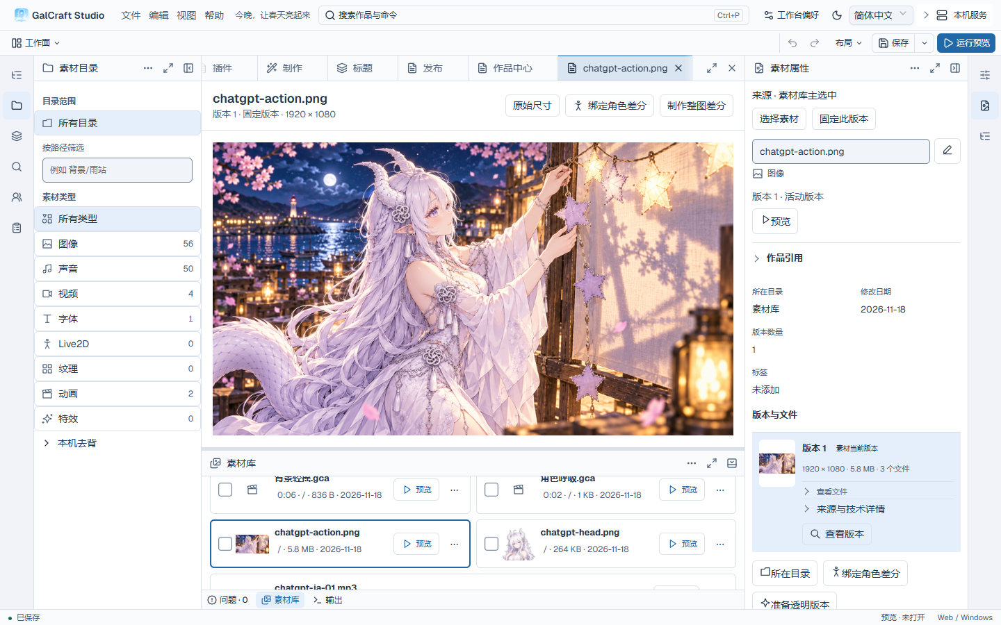
Choose Workfaces → Asset management, or open Asset directory, Asset library, and Asset properties individually from their rails. The directory sets the scope and type, and the bottom library provides search, sorting, pagination, and checkboxes. Clicking an asset changes the primary selection and updates any properties panel following it. Double-click its name, thumbnail or empty row space to open the central preview; Preview and Enter remain available. The same asset reuses its preview tab. Filtering, pagination, and switching documents preserve the primary selection and the checked batch.
In the Asset library, choose Import assets or drag files in from the file manager. The result shows cumulative successes, remaining failures and each failure reason. Expand an item for its complete path, fix the problem and choose Retry failed items to retry only those files in the original batch, retaining successful assets. Closing the result hides its details; receipt history retains each attempt and its original issues, including completed batches after reopening the project. Save all after importing.
Open the batch's successful assets to browse them temporarily; newly successful assets from retries join that scope. Return to the original browsing view to restore the search, folder and type, sorting, page, checked assets, primary selection, viewed versions, pinned Asset properties, scroll and focus. Importing and browsing retain the original checked set. Browsing preserves fields and save state; retrying, applying a field and saving keep their explicit actions. Remaining failures share one summary in Problems. When they all recover, the summary clears and receipt history remains available.
Search, sorting, counts and import share a compact toolbar. Expand receipt history, failure details and batch actions as needed. A short bottom panel uses complete compact asset rows. Use the library's focus/restore control for more browsing space, then restore the original Dock arrangement with the central document and unapplied input retained.
Choose a folder and type in the Asset directory, or enter a path such as Backgrounds/Old street in Filter by path and press Enter or leave the input. In the Asset library, search by part of an asset name and leave the input to update the results. Sort by name, size or modification time in either direction. The pagination controls keep assets checked on other pages.
Empty libraries offer file import. No matching results offer Clear filters while retaining hidden selections. Zero results omit pagination; an empty selection hides batch actions.
Details, versions and pickers
The central preview and Asset properties identify their respective asset and version. Pinned properties retain their source while you browse other assets. In Versions and files, choose View version to preview that exact version. Choose Follow active version to view whichever version is currently active. Image previews fit the window by default and offer Actual size. Audio and video play in the central preview. If a preview fails to load, check the version and failure reason, restore the file and choose Retry preview.
To change the asset's active version for the project, view the target version and choose Set as active version…. Review the affected references in Switch active version, confirm and save the project. References that follow the active version use the new version. Fixed references retain their own versions.
Expand Project references to see which references follow the active version, use a fixed version or point to a missing version. Inspect referenced version selects that version in both the properties and preview. Where Locate source is available, it opens the corresponding scene instruction, decor layer, scene entry settings or character section. Choose Return to assets to resume the same asset view, with its filters, page, checked assets and scroll position.
Press F2, use the asset menu or edit the name in Asset properties. Enter commits and Escape restores the name. Rename edits the name stem and preserves the suffix, asset identity, original files and references. Choose Show folder to open the file location.
Instruction fields, page backgrounds and image slots use the same picker. Search, select an asset and version, preview it and apply. Cancel retains the previous reference. A pinned older reference remains visible as Referenced version even outside the filter; normal results identify Current version. Looking or listening does not replace the reference or update recent selections. Missing pinned versions show a reason; restore that version or explicitly choose another. Clearing a field unbinds it without deleting the library file.
Import remains available beside existing results. The receipt retains successful assets and failure reasons. Temporarily browse this import's successful assets, then return to the original search, tab, page, selection, exact reference and scroll position. Importing and browsing retain the original field and the library's checked batch. Select an asset and explicitly apply it to change the field; cancellation or failure preserves the original binding and selection. Closing the picker returns focus and scroll to the original asset field, including after its first binding changes the label or an asset is renamed.
Character reference images and shared differences use this same picker. Reference images are appended only after you apply, with duplicates removed; cancellation retains the original list and character text. A shared difference can follow the active asset version or pin an exact version, which its preview also uses. With an empty image library, open the picker from Add difference, import an image, then explicitly apply it to create the difference. Cancellation retains the character input. Continue with Save current character after applying.
Selection, naming and removal
The toolbar counts checked assets overall, on this page and elsewhere. Ctrl-click toggles a checkbox. Shift-click checks a range from the anchor on the current page. Context menus, More and keyboard menus distinguish the current asset from the checked batch. Select page and Select all results add different groups. Use Inspect selected to check names, types and scope, and expand paths as needed. Closing the sheet restores the library's filter, page and scroll position. Remove stale selections to continue with the valid ones.
Batch rename opens a persistent central document. Enter a template, preview old/new names and extensions, then apply the batch. For example Spring_Background {number} inserts a sequence. Switching documents retains the plan; one undo reverses it. Save all. Closing an unapplied draft asks how to handle the input. The template edits only the name stem; each preview and applied name keeps its original suffix.
Confirm the scope before removing assets. Follow reference locations and unbind story or page usages first; deleting files directly bypasses those protections. If the index changed, recheck the selection. Clearing selection affects the selected set only.
Local background removal
In the Asset directory, expand Local background removal and prepare its model. The first preparation may download files, and progress appears in the expanded section. When ready, view the image's active version and choose Prepare transparent version in Asset properties.
Compare original and candidate edges, hair and clothing. Choose whether to retain existing references, update floating references, or create a new asset and transfer selected references. Review counts before confirming, then save. Cancel retains the original. For failure, fix the reported network, model or disk issue and retry. Pinned versions remain distinct from floating references, so changing the active version does not change every historical binding.
Page building
Open Page building from Workfaces or search for it with Ctrl+Shift+P. Open Page directory or Page outline individually from Show tools or a tool rail. Open a page from the directory, then select a component on the canvas or in the outline and edit it in Properties. The outline follows the last active central page, and each page keeps its own tab and selection.
- Canvas lets you select and drag components and edit their properties.
- Styles edits styles for the current page or component.
- Behavior edits interaction blueprints. Choose Side by side to see the canvas and behavior for the same page together.
- Navigation preview sends clicks to the Player. After trying a transition, return to Canvas to resume with the original page and selection.
Use Page actions for project templates, interface animations, startup preview and actions that apply to the selected page. Use the Studio toolbar for saving, undo and redo in the workbench. The standalone page designer has its own save and history controls. Studio and Player language settings remain separate.
Behavior blueprints
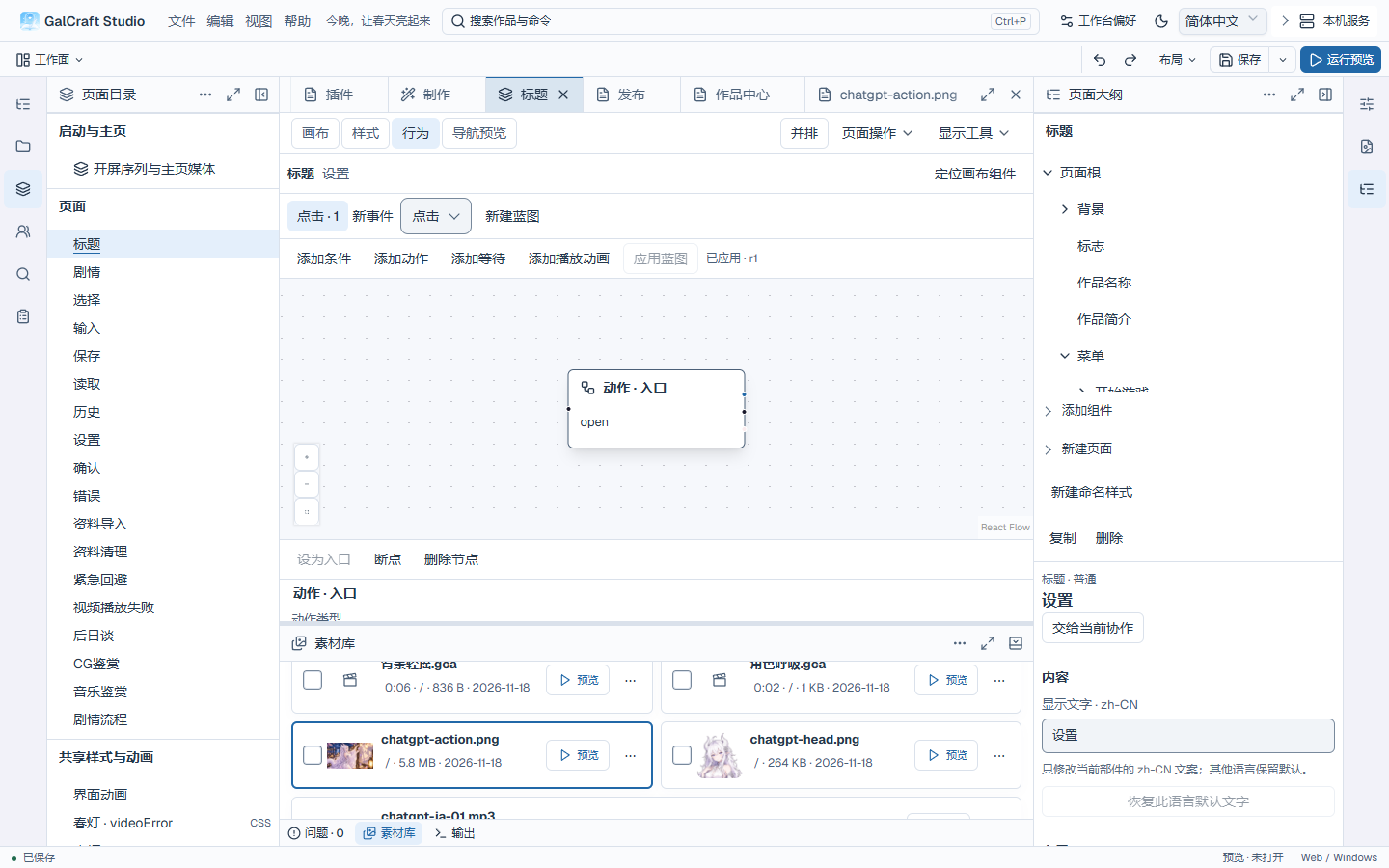
Use Behavior in the page tab for a multi-step interaction. Show canvas and behavior side by side keeps both views on the same page and component. For a supported existing interaction, choose Convert to blueprint. The binding keeps its place in the event sequence, and Undo restores the original binding. Simple actions remain available in the component's interaction fields.
Select a node to edit its inputs and connect its result to the next step. Apply validates the draft and updates the working copy. Save the page to use that revision in the Player. In the debug preview, choose the applied graph or a valid draft, set a breakpoint and use Step or Continue. The run shows the graph revision, branch, node value and diagnostics in an isolated Player.
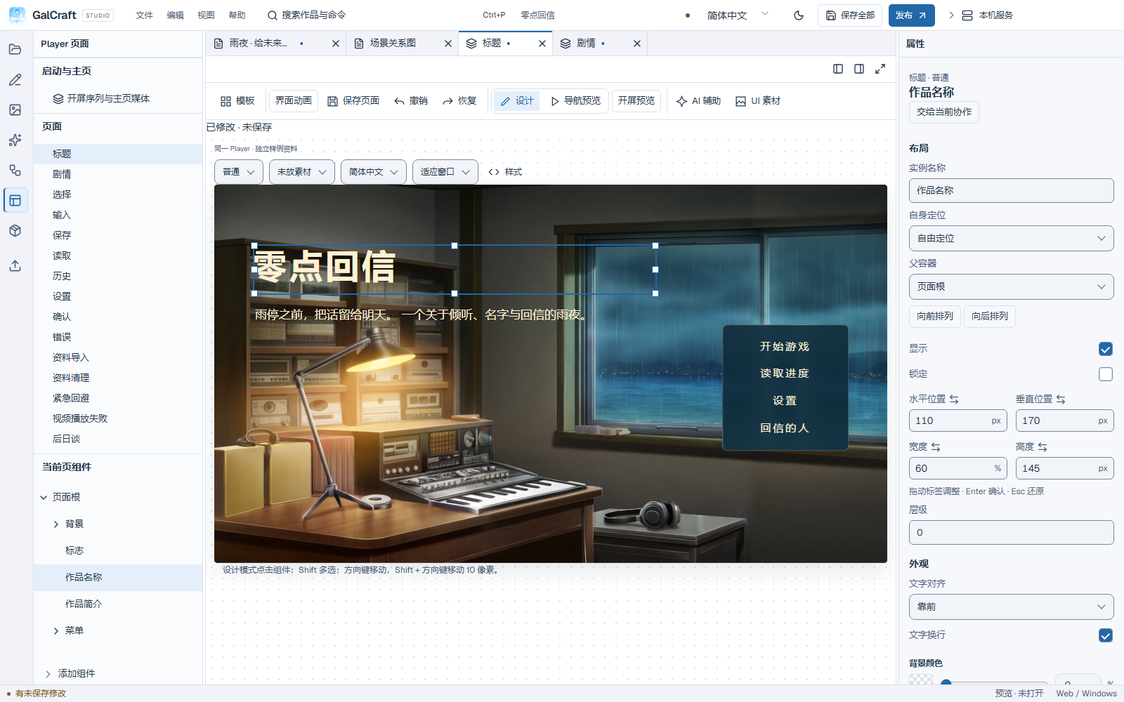
Drag a component and release to commit one move. Arrow keys move 1 logical pixel, Shift+Arrow moves 10; Shift-click selects multiple components. Unlock a locked component first. Escape cancels an active drag.
| Control | Purpose |
|---|---|
| Page background | Combined colour/opacity, background asset and image opacity when no component is selected |
| Component properties | Visibility, lock, position, size, text and colours exposed by that component |
| Image slot | Bind an image with contain, cover, native-size or nine-slice fitting |
| Interaction state | Normal, hover, pressed, focus and disabled styling |
| Page samples | Long Chinese/English/Japanese text, empty/full saves, locked/unlocked content |
| Zoom | Fit or 100%; does not change the logical canvas |
| Design / Preview | Preview sends input to Player; Design restores selection and dragging |
The Inspector presents content, layout and appearance for the current component, showing content when editable fields exist. Page backgrounds expose colour, image and image opacity first. Expand Page transitions, Animation & transitions or Image slots & sources for the existing animation, segment, playback and source tools. Multiple selections identify the current property target and the scope of Align left.
Page-background and component-text colours share an alpha-capable HEX, RGB and HSL panel. Changes preview first; Enter, Confirm or clicking outside commits one undoable edit. Escape restores the opening value. Background colour and opacity retain their separate stored values. Position, size and image-opacity fields support label scrubbing, precise input, Enter and Escape. Reading-panel backgrounds and the NVL mask retain their swatch, slider and percentage controls.
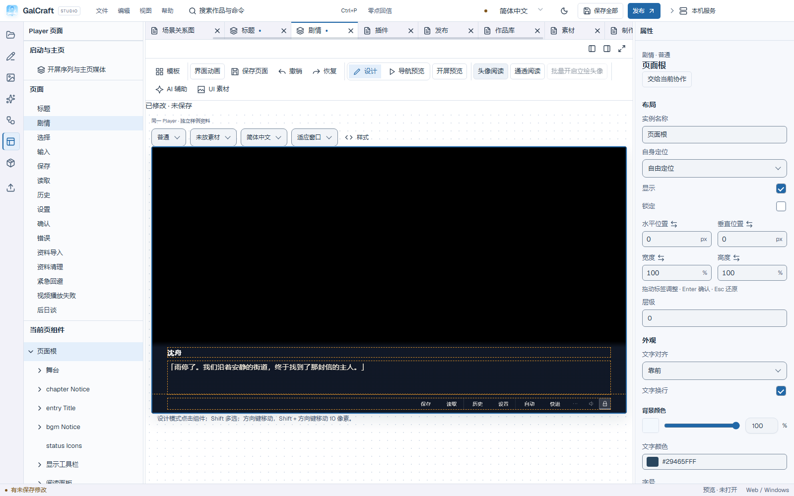
Project CSS participates in the existing style precedence. A template rule can override a component text colour. Expand Image slots & sources to inspect its source or edit the relevant CSS / SCSS rule.
The designer previews filled-save and unlocked states with independent sample data. Save the page or all project changes. Undo/redo use the normal shortcuts.
Unread and read text styles
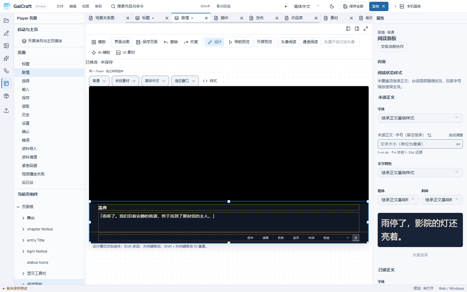
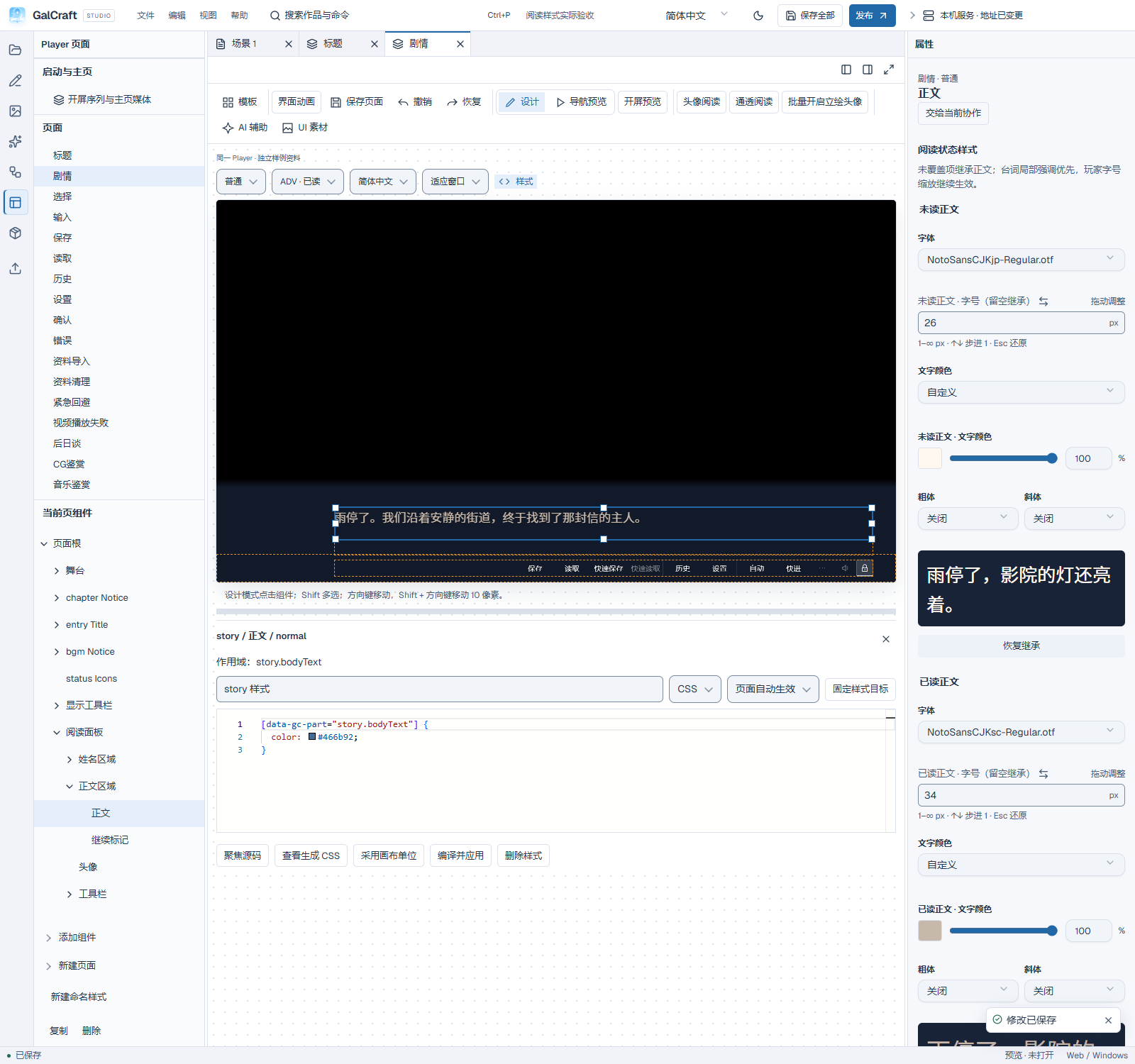
Select the reading panel or body on the Story page and open Reading state styles. Configure font, size, colour, bold and italic independently for unread and read text. Choose Inherit body style, leave size blank, or select inheritance for bold/italic to retain the existing body appearance. Import work fonts before selecting them; both selected fonts travel with backups and releases.
Choose ADV · Unread / Read or NVL · Unread / Read in the page samples to check the actual Player text, fonts and layout, then save. Local dialogue styling takes priority and player text scaling still applies. Speaker names and history keep their own styles.
Player records the departing sentence as read only after successfully entering the next sentence, choice, input or film, or completing the story. First display, full reveal, saving and directly loading that save retain unread state. After a successful departure, loading an older save uses the current persistent read record. Completed NVL paragraphs use read styling; continuation pages of the same sentence keep its current state.
Expand Image slots & sources and select Icon. Common icons offers 15 named action previews: Start, Save, Load, History, Settings, Pin, Auto, Skip, Title, Back, Music, Gallery, Exit, Story flow and Characters. The lantern remains a decorative project image. Project images selects your own image. Monochrome presets follow button text colour; colour project images retain their original colours. Selection, replacement and clearing are undoable. In a non-normal state, Inherit normal icon restores the normal-state icon. Save the work to carry the actual referenced files into backups and releases.
Reading panel and portrait space
On the story page choose Reading panel. Portrait reading reserves left-side space and shares one background for portrait, name, text and tools. Clear reading reduces background coverage for compositions focused on figures. Existing templates retain their layout until a preset is explicitly applied. Then select story.readingPanel to refine it.
Check background colour and opacity against bright and dark scenes. Adjust background opacity independently from the whole component so text remains legible. Use top fading, name alignment, portrait width and padding to keep long dialogue away from edges and tools. A portrait slot reserves space. Dialogue, current-speaker settings, character defaults and enabled stage crops determine the image. Configure those in Authoring, then test speaker changes, explicit hiding and narration. NVL normally hides portraits and figures.
Actual reading, the settings reading sample and the current-instruction stage share the same reading surface. The sample work's blue-tinted panel, name, portrait, rich text and ADV/NVL layouts follow the same template. Font size, typing speed and textbox opacity update the settings sample immediately. Its independent loop restarts when speed changes and does not advance story progress or write real saves.
CSS, property sources and templates
Choose Styles in Page building to edit the current page or component. The editor shows where the style applies and lets you edit its name, language and activation. Expand CSS selector reference for the selector. Choose Compile and apply to update the work, then save from the workbench. If compilation fails, the source stays available and the preview keeps the last working style. Opening an existing named style from a component’s Image slots & sources opens that style’s central tab and keeps its original page or component scope.
Page actions → Project templates opens the central template workspace. Choose lightweight, standard or rich and read the page additions, changes and hiding impact. A switch covers the complete Player UI: title, reading, settings, saves, galleries and their components, layouts, interactions, styles, animations and dictionaries. A reading-layout or color change can use a smaller edit. Story, characters, the asset library and player data stay with the project. Preview when the current goal needs it.
The plan compares the real source at adoption, the current project and the incoming template. Unchanged fields follow incoming defaults; author changes stay by default. Both-sides changes expose conflicts, including whole-page keep/take choices. Author-added pages, components, interactions, bindings, named styles, animations and dictionaries retain the associations needed to remain usable. Author CSS/SCSS keeps its original text with an enabled/disabled choice and an explanation of overrides.
Old official-only pages can be hidden with complete configuration and later restored through Restore hidden page. Resolve actual consumers and keep required entry points valid. A missing reliable source baseline is explicit: conservatively keep current content and choose keep/replace. The template baseline retains the adopted page, style, dictionary and related asset source content. Resolve blocking conflicts and unapplied inputs endangered by structural changes before applying. Existing authorization can cover conflict choices without asking for each field again.
Apply creates one undoable group of project changes; formal saving is separate. The new baseline records the real incoming source, while the merged author result belongs to the project. Ordinary saving does not redefine the baseline. Copies, backups and restores carry source content and identity mappings independently of the local source library.
Complete template exchange and local library
Export a .galtemplate from the current applied working copy, including unsaved changes, without automatically saving the whole project. Unapplied form text stays outside the package. The package fixes that revision's UI configuration, author UI text, style source and corresponding effective CSS, dictionaries, animations, referenced assets/variants and exact dependencies. Source/CSS inconsistency blocks export until compilation is corrected. Examples require explicit selection. Story, character records, tasks, player data and personal connections stay outside by default. Exchange covers complete UI packages.
Import adds a local library item; same-version imports offer keep, replace or copy. Copy official entries under a user identity; update, rename or remove user entries. Packages with missing plugins can remain in the library with diagnostics; resolve blockers before applying. Map project-specific bindings to real compatible target identities/scopes or explicitly unbind them. Templates do not automatically copy characters or variables. Removing a library source leaves adopted project content usable. Ordinary production and switching add no library cleanup.
Read-only JSON supports inspection/copying; editable code supports highlighting, formatting and error locations.
Changing templates selects an available page in the new template. When a requested preview is preparing, wait or retry in place. Close styles from the top-right corner of its heading; compilation shows a busy state and prevents duplicate application. The design canvas is a visual sample: screen-reader users select objects in the component tree and edit their properties. Navigation preview exposes the interactive Player to assistive technology.
UI asset production
Select the page and optionally a component, then choose Page actions → UI assets. Check the page and component scope in Production. Choose Return to origin in the draft or Return to source in the task to restore the page and selection. To use a generated image or existing asset, bind it to the component’s image slot and save the page. Use the preview and property sources to compare results. Prepare and review layout and style candidates in the same workbench. Production guide
Binding fields and the emergency page
Binding choices describe real paths, value types, access and scope; connected clients use the same directory without reading private player records. Story variables retain their stable identity and progress/local/longTerm scope, with local variables tied to the actual declaring scene. Zero, false and empty text are valid values; missing-value text is for a genuinely absent value.
Design emergency content as an empty page, an image, text or existing components. F8 is the default; the author can set a project default and players can override it. Press the same key or Escape to restore. Emergency immediately covers ordinary pages, modals, video, startup and entry media, pausing sound, story advance and play time. Its page cannot advance/jump the story or save/load. Restoration retains the underlying page, story position and earlier pause reasons; auto and skip remain off. The restore button may be hidden.
Startup and home
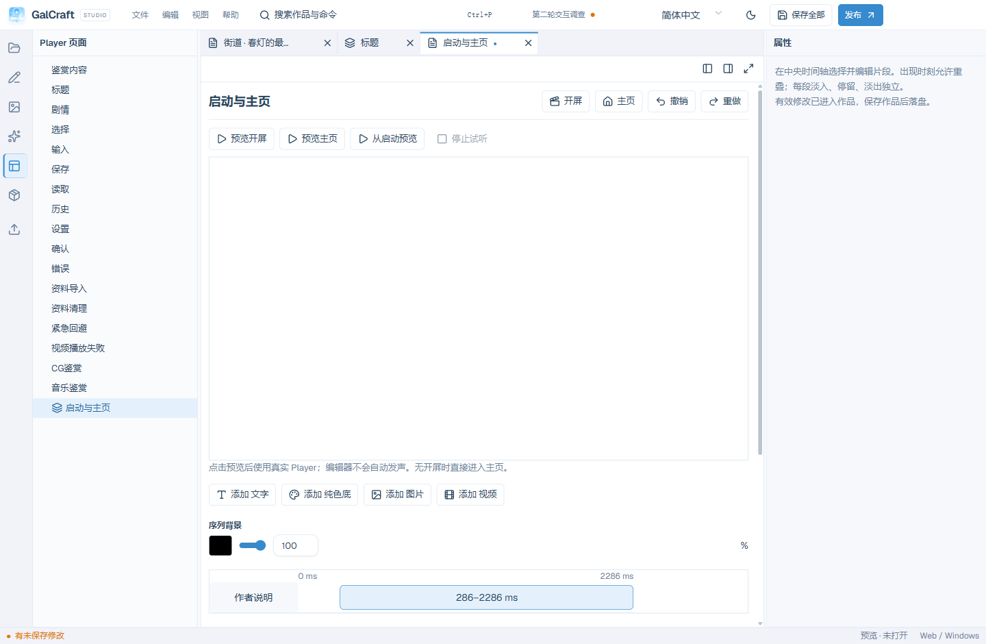
Open Workfaces → Startup & home, or choose Startup sequence & home media from the Page directory. In Splash, choose Create native startup sequence, then add Text, Color, Image or Video clips. Each clip has a name, an absolute start time from the beginning of startup and independent fade-in, hold and fade-out durations in milliseconds. Clips can overlap; their list order determines their layers. Select a timing bar or name to edit it. Move layer earlier changes the order and Delete clip removes that clip's configuration.
- Add text, enter a notice for the current language and choose its colour. New text defaults to 250 ms fade-in, 1500 ms hold and 250 ms fade-out.
- For image/video clips select an existing asset of the matching kind, then set its fit. Video exposes its start in seconds and clip volume. Check that the asset itself previews correctly.
- Set Start time · ms and Clip fade in / hold / fade out · ms. Scroll the timing area horizontally for a long sequence.
- Title reveal offers Fade background after clips or Fade the final clip and background together. The former uses Reveal home · ms, defaulting to 3000 ms. The latter uses the final clip's fade-out duration for the whole opening layer; timing begins when title resources are ready.
- Use Preview clip, then Preview splash, Preview home and Preview startup. Isolated previews create neither story progress nor real saves.
- Apply valid changes to working content and save all, or use current save to check and apply ordinary numeric fields in startup settings and the clip sequence before opening save review. Switching between Splash and Home keeps unfinished numbers. If a number is invalid or incomplete, current save returns to its field for correction and retains the last valid preview.
Colours, audio loops and other complex adjustments keep their explicit confirmation actions; current save preserves adjustments awaiting confirmation. Canceling save review retains applied changes as unsaved. A failed clip deletion retains its input; successful deletion clears only that clip's input, preserving other clips.
With Allow right click or physical Esc to end startup enabled, right click or the physical Escape key ends this startup and enters home. Left click and Enter do not skip, and startup has no visible skip button. The skip input is consumed before home handles input. Story opening/ending videos have separate skip rules. Older projects without a native sequence still read their existing single-image/video startup configuration.
A newly created official sample uses a black background and centred white project title. It selects Fade the final clip and background together, with 0/600/1200 ms fade-in/hold/fade-out. After the title page is ready, the text and black background hold, then fade together. Title music enters during the reveal; the story OP plays after Start game. Choose Page actions → Preview startup in Page building to replay the full opening. Returning to the title page does not replay it.
In Home, choose Home background, Home music and Home video, then set volume and looping. Expand the music’s Start, fade and loop range or the video’s Playback range and fit for more settings. Times must fit the asset and end after the start. Video is muted by default. If you enable its audio, it plays alongside home music. Choose Preview home to start playback and Stop preview to release the media. Switching between Splash and Home or leaving the document also stops playback. If autoplay is blocked, Enable sound resumes current media.
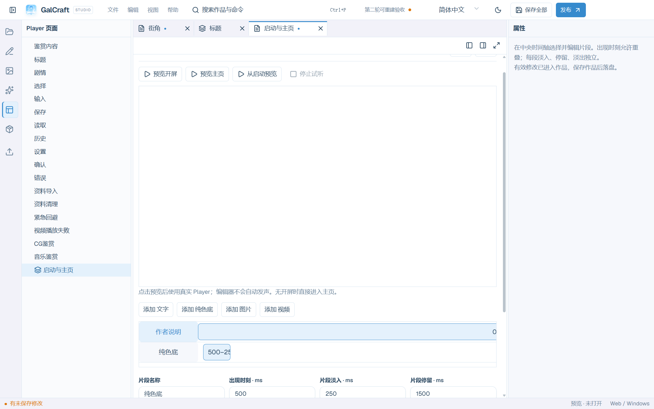
Sequence and clip colors share the same picker, including alpha, HEX/RGB/HSL and live preview. Enter or an outside click confirms; Escape restores the starting value. A failed commit keeps the adjustment and error visible. Preview, layer and delete actions stay in the current clip heading when its text grows.
When closing Startup and home, choose Keep changes and close to return to the same startup clip and unapplied input after reopening. Discard and close restores the saved settings after you confirm the discard scope. Use the workbench toolbar for Undo and Redo.
Gallery content and UI animation
Open Gallery content in the Player page tree, select CG, movies or music and add entries. These are project content; page samples are silent design fixtures. Entry names, series and order are undoable unsaved edits. Save the item through review or save all.
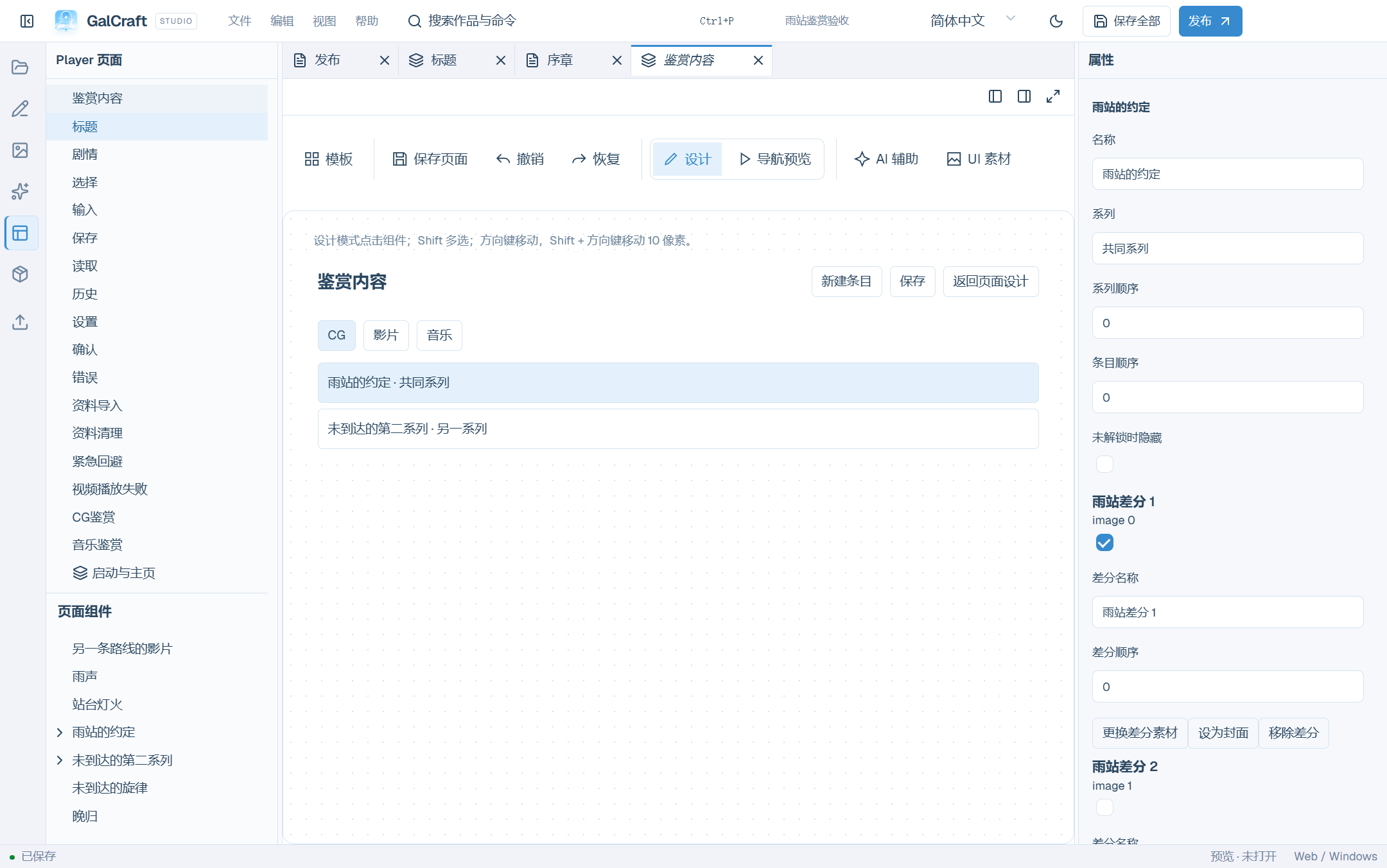
Each CG variant has its own identity. Add images, name/reorder variants and set a preferred cover. Player uses the first unlocked variant when that cover is still locked. Renaming/reordering preserves unlocks; later variants remain locked. Choose hiding a locked entry or displaying an anonymous placeholder. Movies/music use real media and optional image covers; check names and durations.
To connect story unlocks, select a background, BGM or movie instruction before opening Gallery content. Create and link in one transaction or link the current instruction to an existing entry. Background linkage requires a matching image variant. Select multiple CG variants for an explicit unlock after the current line. Music and movies also have explicit unlock instructions. Follow listed unlock locations before removing referenced content.
Page samples include 16 CG slots, nine movie slots and six simulated tracks, partial unlocks, viewer, long multilingual text, playback/failure states and actual content. Select a repeated item to edit its shared template, then select cover/title/lock subparts. Preview normal, hover, pressed, focus, selected, disabled, locked and empty-slot states.
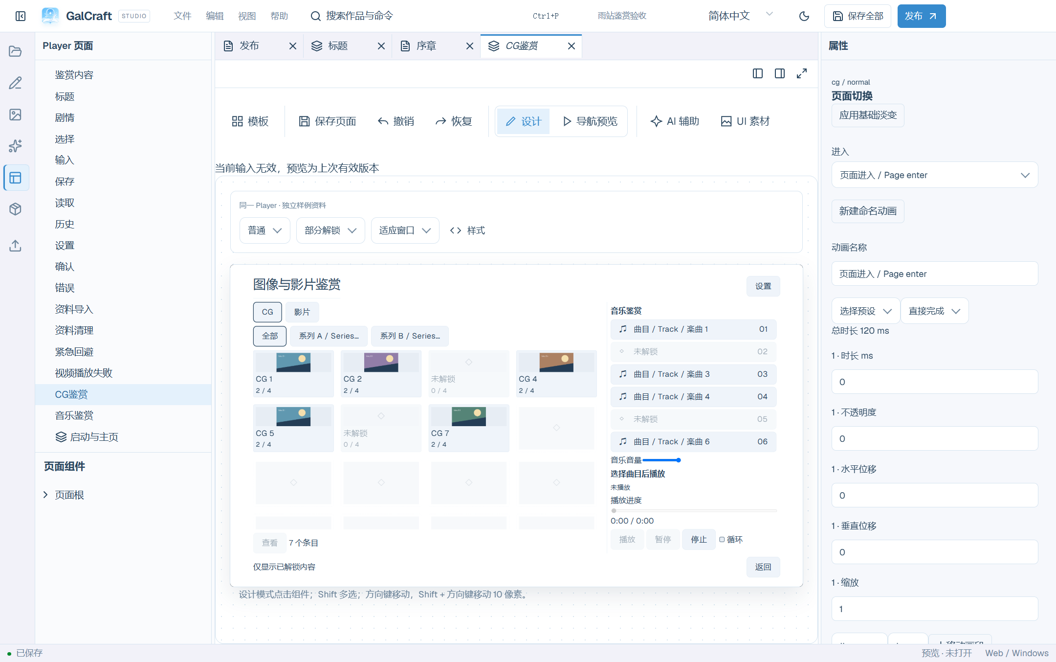
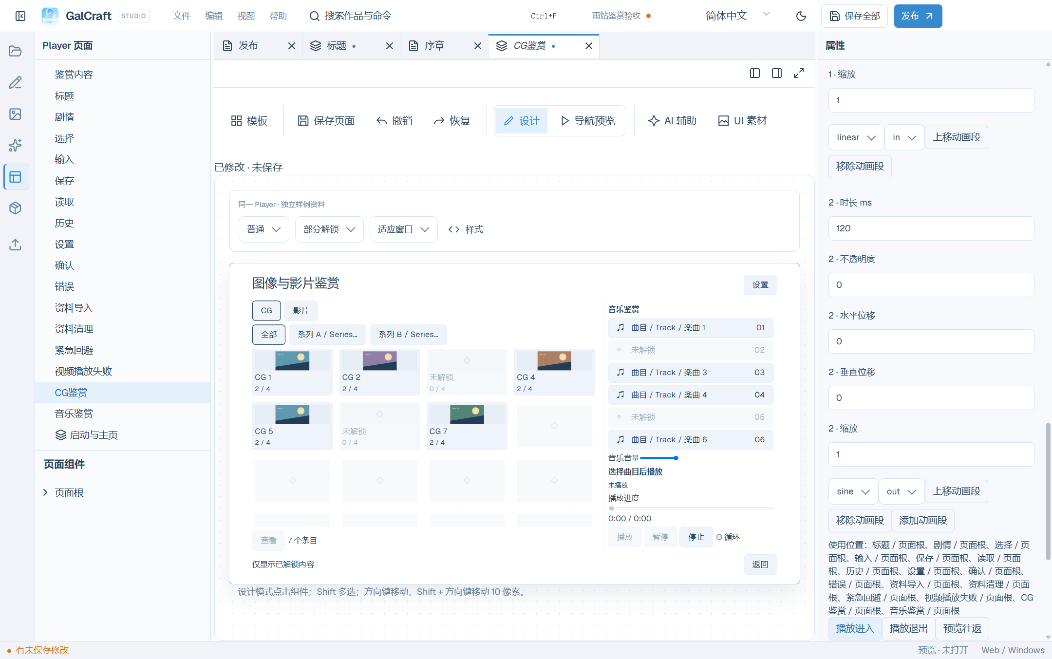
Page roots expose entry/exit animations; components expose show/hide/hover/focus. Reuse a named animation, or create/rename a fade or directional slide, adjust segments/easing and review usages. Editing a reused definition affects all references. Entry, exit and round-trip previews animate UI without advancing the story. Apply basic fading adds undoable bindings to old pages. Reduced-motion behavior completes directly or uses short fades according to the definition.
Upgrade an older gallery
Close the project and preserve a complete backup first. Maintainers can run node tools/upgrade-player-gallery.mjs "absolute project path" "dedicated backup directory" in the desktop repository. The tool backs up the complete project, reports ambiguous background/variant matches and commits only unambiguous references. Resolve reported instructions and retry; repeated runs retain the original backup and variant list. For restoration close Studio, preserve the current directory separately and restore the complete backed-up work directory. Older Player data requires the original variant mapping; find that backup instead of guessing a mapping.
Live2D and plugin asset types
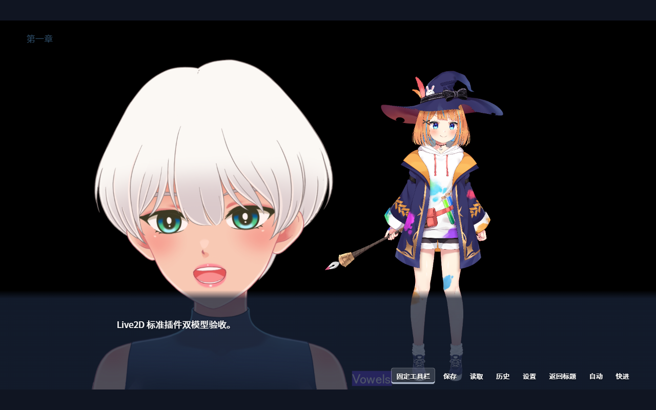
Install and enable Live2D 0.1.1 for the project, then import the matching Cubism Web R4 SDK in project settings. MotionSync also needs its R2 SDK. Studio includes the plugin implementation. Supply Core via the Cubism SDK. Studio 0.2.0 bundles engine 0.2.0. Use Project maintenance to check the locked engine. Check target settings and dependencies in Publish before building.
Import a complete model directory or its .model3.json. Select the Live2D type in the Asset directory, then select a model in the bottom library to see the central preview and the plugin's model capabilities in Asset properties. Figure instructions expose supported motions, expressions, blinking, gaze, parameters and lip sync. Missing textures list referenced paths. Restore the locked Core version and retry when needed. Choose basic lip sync or MotionSync according to the model's capabilities.
Disabling or losing the plugin retains files and commands with capability diagnostics. Restore its exact version to continue. Legacy galcraft.live2d identity uses the provider's declared reading mapping. Check Web/Windows exports and SDK redistribution eligibility; export only required model groups, plugin runtime artifacts and permitted external files.
The Asset directory shows plugin asset types with names, icons and library-wide counts. The bottom library and asset pickers use the same type identity. Type-specific filters match fields on the active version. The library retains checked items across pages, and pickers filter by the destination field's declared types and capabilities. View an asset's active version, edit Type properties in Asset properties, and apply. Invalid values remain visible with their errors. A valid edit creates a new active version. References that follow the active version update and fixed references keep their versions. Undo, redo and save use the normal asset transaction. Changing an instruction instance affects only that location.
Preview does not require a valid story, adopt candidates or modify the project. Changing selection, closing a panel, disabling or reloading a plugin releases old previews. Missing exact providers leave unavailable categories, general metadata, original data and files intact.
Troubleshooting
Check references before removing an asset. A prepared background-removal model still needs an image processing/adoption step. A component that will not move may be in Preview mode or locked. A cropped image needs its fit/size checked. Faded dialogue may come from whole-component opacity instead of panel-background opacity. A reserved portrait slot still needs an enabled story portrait source.
14. Startup timing and asset type icons
Drag a clip bar in Startup & home to change its start time. Release to commit one edit, or press Esc to cancel the drag. Focus a bar and use the arrow keys for small changes, with Shift for larger steps. Horizontal scrolling retains long sequences. Text, color, image and video clips use distinct icons. Background and text/color controls expose opacity; playback multiplies color alpha by the clip's fade envelope.
The asset type catalog supplies icons to Explorer, lists, pickers and Inspector. Texture, animation, effect and Live2D use their declared icons; unknown declarations use a neutral file icon. The gallery content document keeps its corresponding business entry selected.
Data import imports player data; Data cleanup clears the selected work's player data. Page design edits the appearance of those pages. Template descriptions reflect their actual purpose.
Independent GCA browsing and editing
Select an animation asset to play, pause and seek a real-stage preview. Open its workbench to edit tracks, keyframes and presets. Figure/background mode and a temporary project image belong only to this preview. Confirming edits creates a new variant; existing pinned references keep their original variant. Save the asset object after applying. See Production for AI creation and local changes.
Interface animation and the work canvas
Page actions → Interface animations opens the work's catalog of twelve fade, directional slide and small-scale fade presets. Edit and preview a preset, then apply an undoable change. Component properties bind supported enter, exit, show, hide, hover, focus and press events; quick editing locates the corresponding definition.
The editor lists every usage. When several components share a definition, Change only here creates a separate copy; editing the shared animation affects the listed usages. Review unbinding before deleting a used definition. One undo restores the definition and bindings. Handle unapplied input before switching or returning. Save all to persist the animation catalog and associated pages.
Dragging a flow component converts it to free placement with its visible dimensions. Releasing commits once, Escape cancels and undo restores its original layout. Geometry, hit testing and preview bounds use the target parent's content area and the work's design coordinates.
Named styles identify host vw/vh and viewport media rules. Adopting work-canvas units first updates the style draft; compile and apply to edit the work. Save-design samples include actual PNGs, one-full/eleven-empty, full, missing-image and long-summary data without writing player records. New official templates and samples use the current canvas, save, animation and ordinary 180 ms figure-replacement fade rules; explicit saved transitions retain their timing.
Story variables and relationships
Select a text component, set the Display text source to Story variable, then choose a number, boolean or string variable by name and scope. The binding keeps the variable's stable identity after a rename. Conditions and action arguments can also read story variables; story instructions and existing operations update them.
Current progress follows the story and restored save. Current scene call reads the active call frame. Player profile reads the current profile's long-term value. Before a story starts, after a scene call ends or when a variable has been deleted, text displays the editable Missing value text, which defaults to “—”. Zero, false and an empty string are valid values.
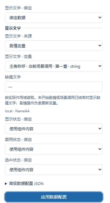
Author-configured relationship pages and HUDs can read core variables through general bindings. Official new templates and the complete teaching sample omit the relationship demonstration; the sample retains three character routes, Story flow and the ordinary afterstory directory. Install the optional affection SDK example through the plugin development workflow when needed. Existing works retain their original plugin configuration and progress.
Edit the selected component’s display text
Select a static button or text component and edit Display text for the current Player menu language. The preview language selects the dictionary being edited; Studio language controls the editor labels. Other components and languages retain their defaults. Restore default removes this language’s override. Apply, save and check the preview and released Player. Dynamic character names, save summaries and story content continue to follow their bindings.
Spring Lights uses four independent home images: memory wall, two group photos and Chinese title artwork. A renamed copy can replace its title image while retaining menu actions and unlock behavior.
Production, services and continuing a story
Configure AI service connections and ComfyUI workflows. Use scripts, prompts or existing assets to create story, images, voices and music, review candidates, adopt results and save. Bring your own external services.
Plugins
Plugins — GalCraft Studio product manual.